Concept Design • Design • Illustration • Animation • Art Direction
COMPANY PROFILE
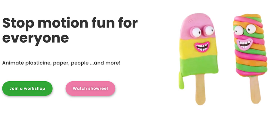
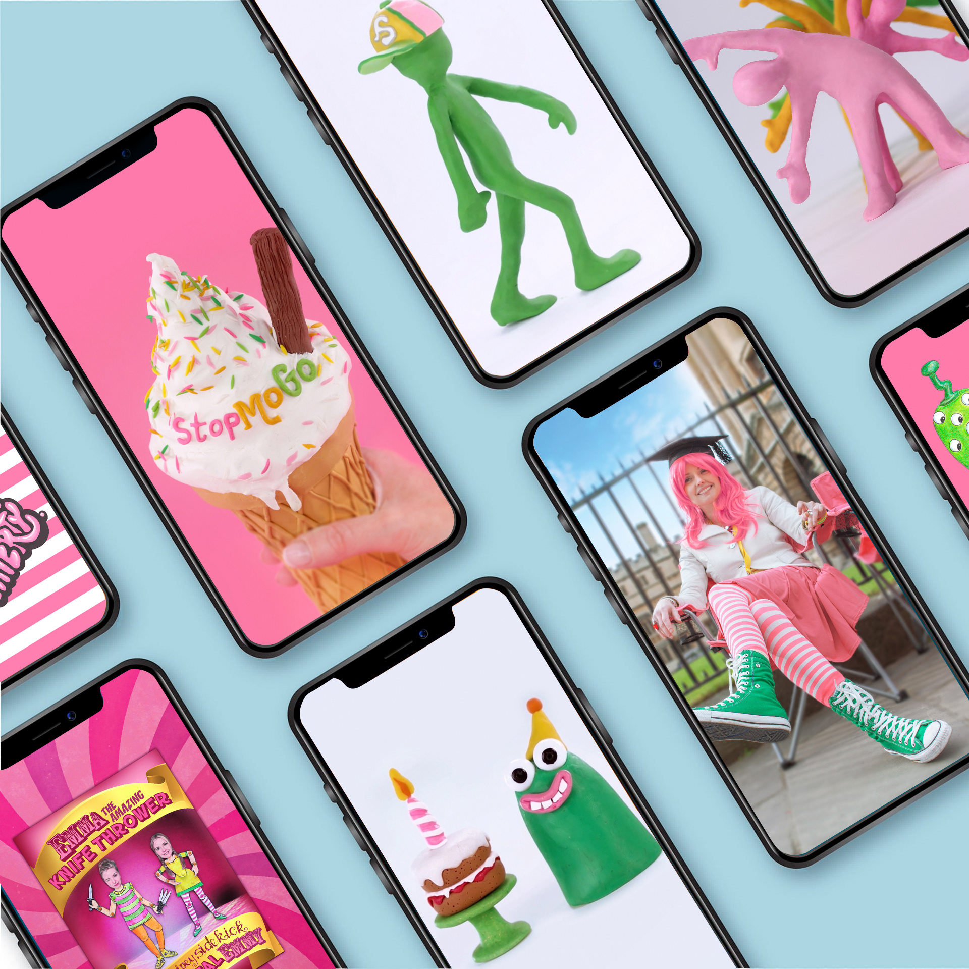
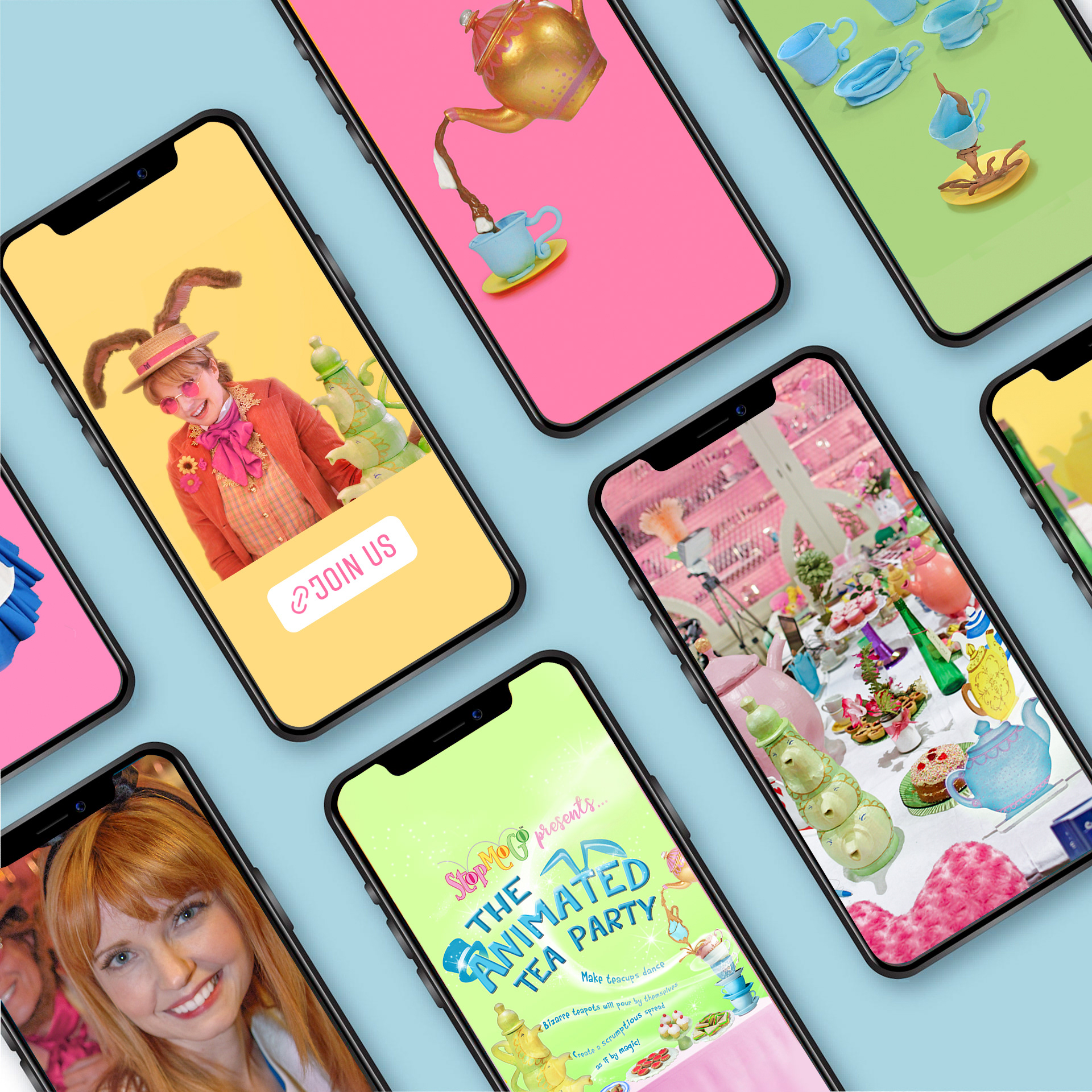
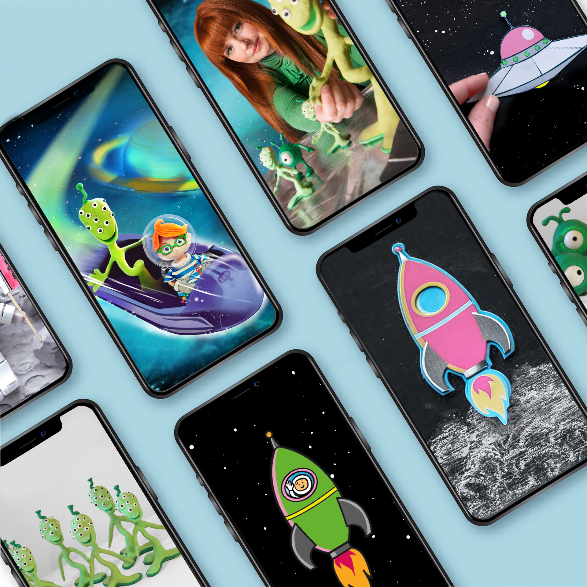
StopMoGo provides stop motion workshops, on-demand courses and events.
MISSION
To share the joy of making stop motion animation through fun and immersive activities.
VALUES
• Delivering a fun and immersive experience
• Empowering others to make the best films
• Fostering a culture of warmth and belonging, where everyone is welcome
• Challenging the status quo and finding new ways to learn
• Encouraging exploration and experimentation
LOGO
I have redesigned StopMoGo's logo three times since I set the business up.
My first logo design sought to be relatable to children with a rounded, hand-drawn 'school' font. This was also a nod to my background as a teacher, and as a reassurance for parents that their children would be in good hands. The bouncing ball arc refers to one of the first exercises animators learn.


I redesigned the logo to coincide with a new website I created in 2014, maintaining continuity with the circles and similar colours. The decision for capital letters and keep words all on one line was to reinforce brand name - 'StopMoGo' as opposed to 'stop mo go'.
I updated the logo for StopMoGo's relaunch after the pandemic. I started by sketching rough ideas, exploring completely new concepts, such as forming the letters from hands manipulating plasticine. I was mindful of various factors including:
• further simplification/reduction of colours
• possible inclusion of mascots
• ensuring it reads from a distance/at a small size
• works in monochrome
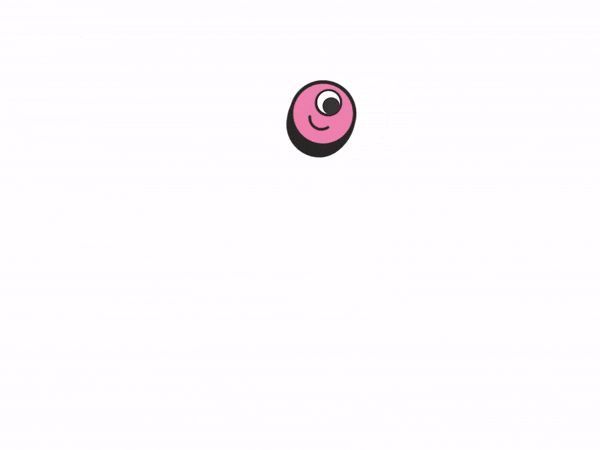
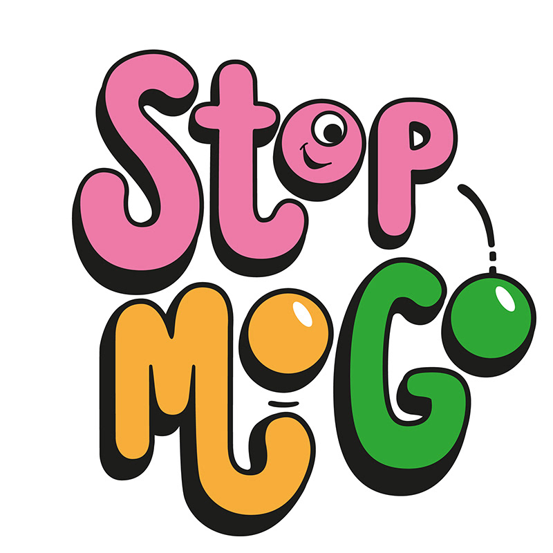
I chose to reference an 80s style and retain the hand-drawn fun, child-like quality. I kept the bouncing ball motif, but wanted to clean it up by reducing the number of colours by removing balls behind and the coloured stroke. Changes also include stronger hues and the introduction of a face that is animated to look at the text, then at viewer to draw you in and a friendly feel.
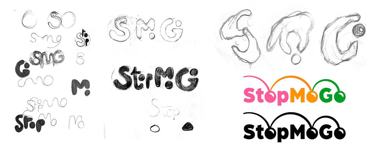
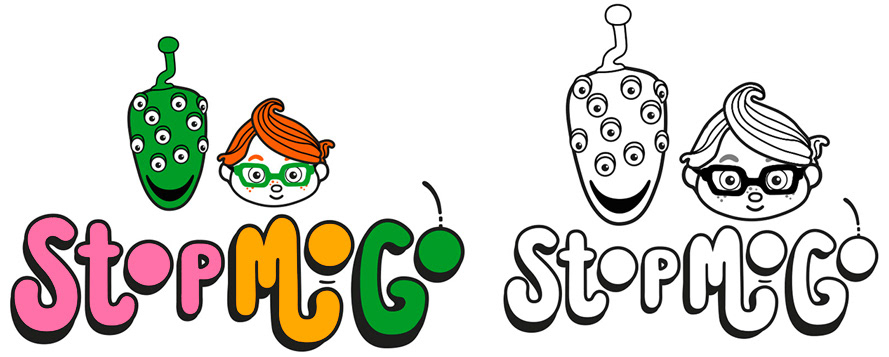
concepts (above), final design (below)

FONT
I chose the typeface Poppins as the primary font. It has a modern and friendly feel, is approachable and positive. It also has a single-storey lowercase letter 'a' to emulate handwriting, making it relatable to children.
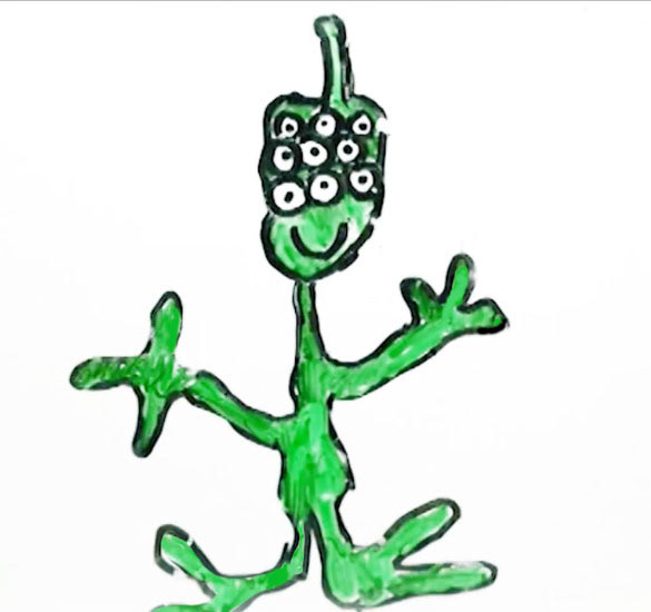
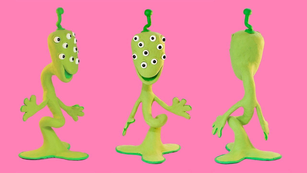
MASCOTS
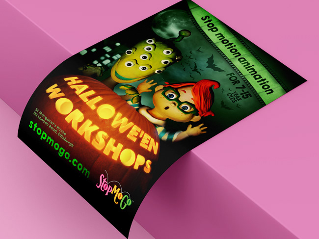
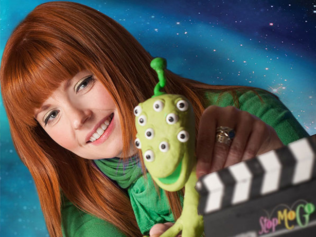
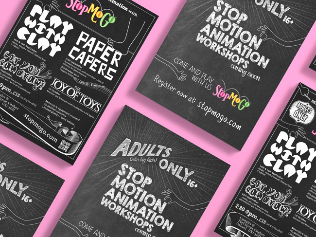
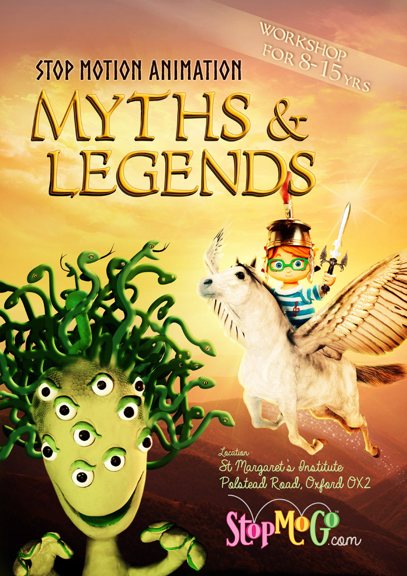
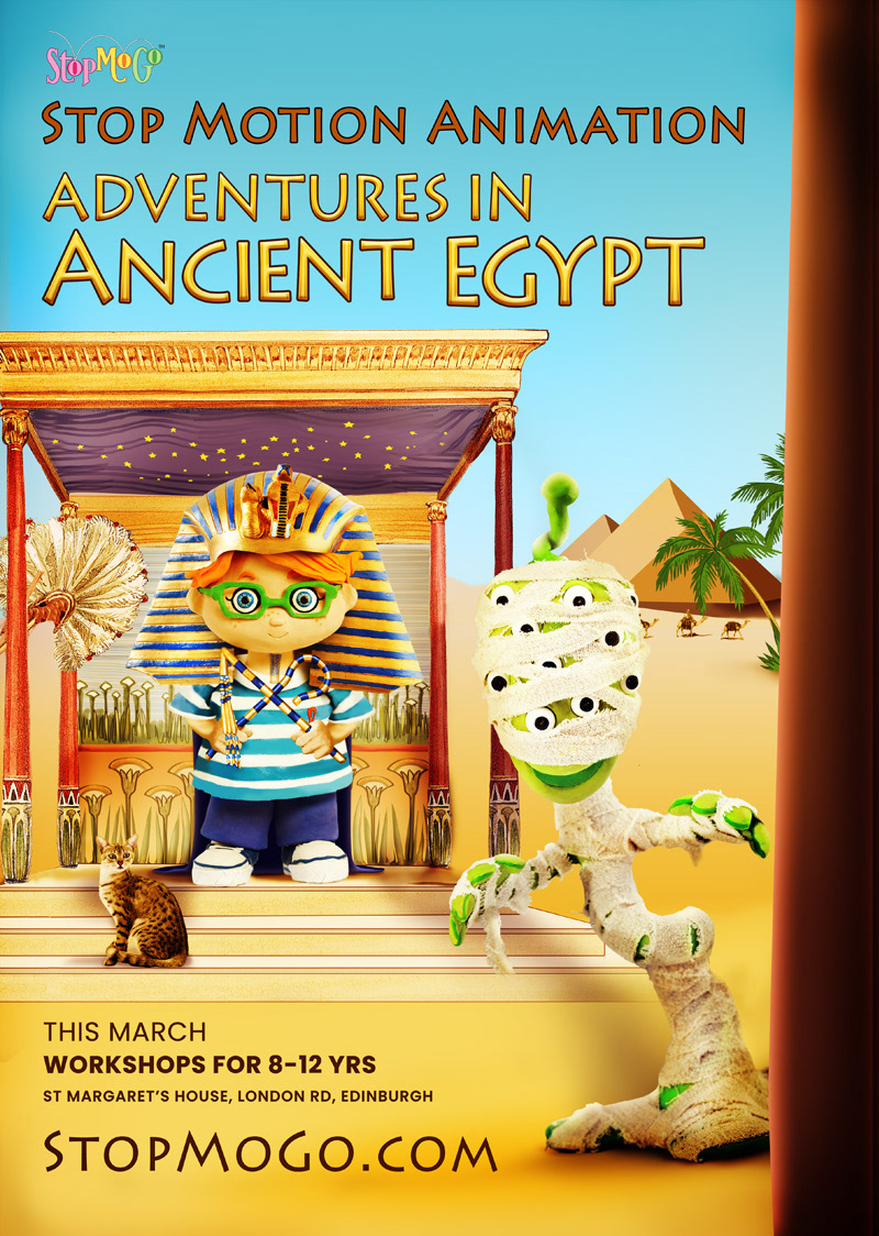
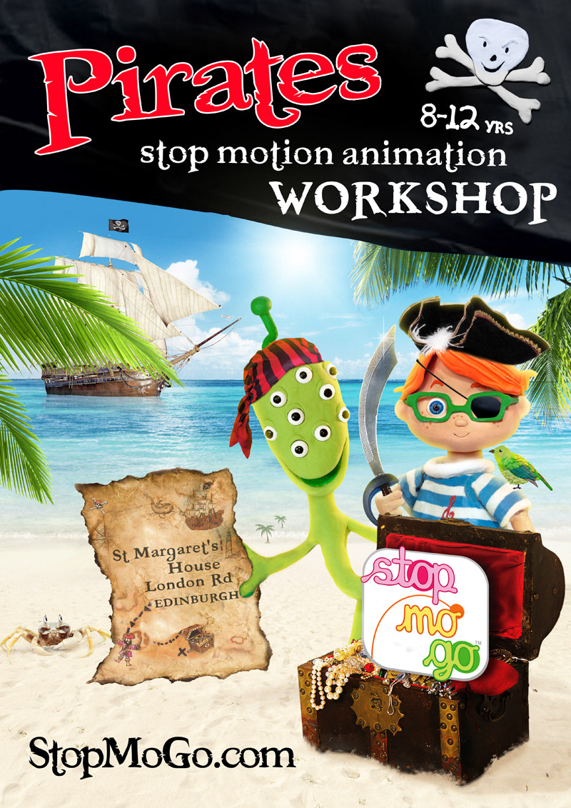
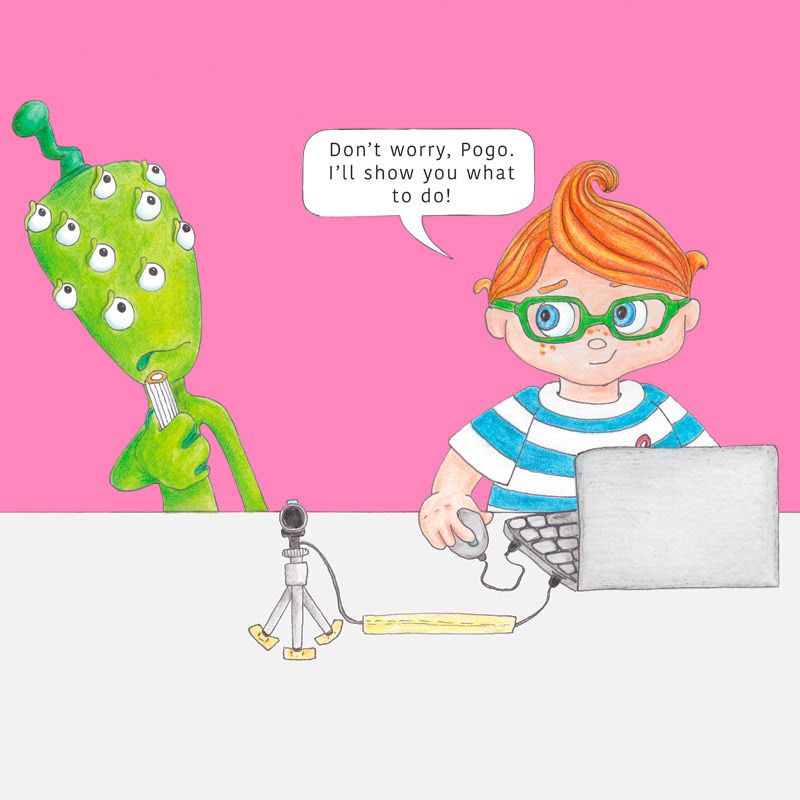
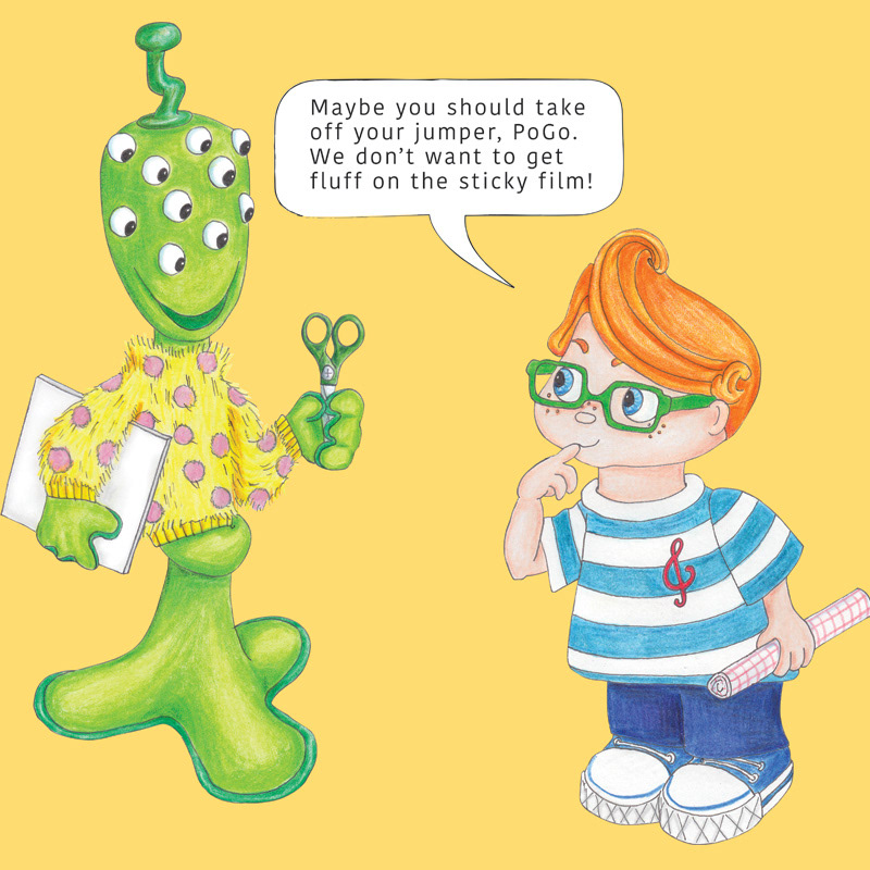
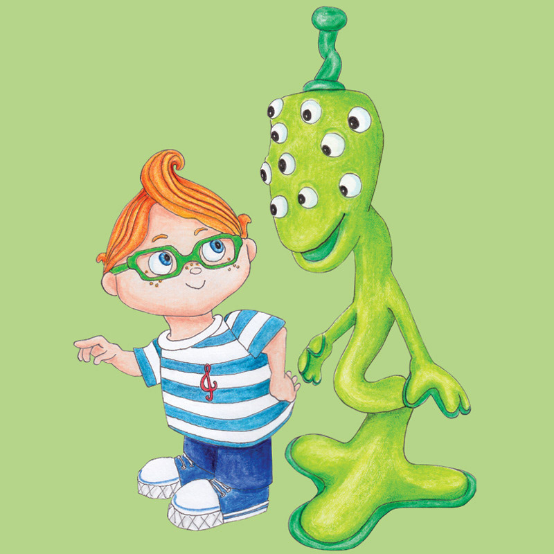
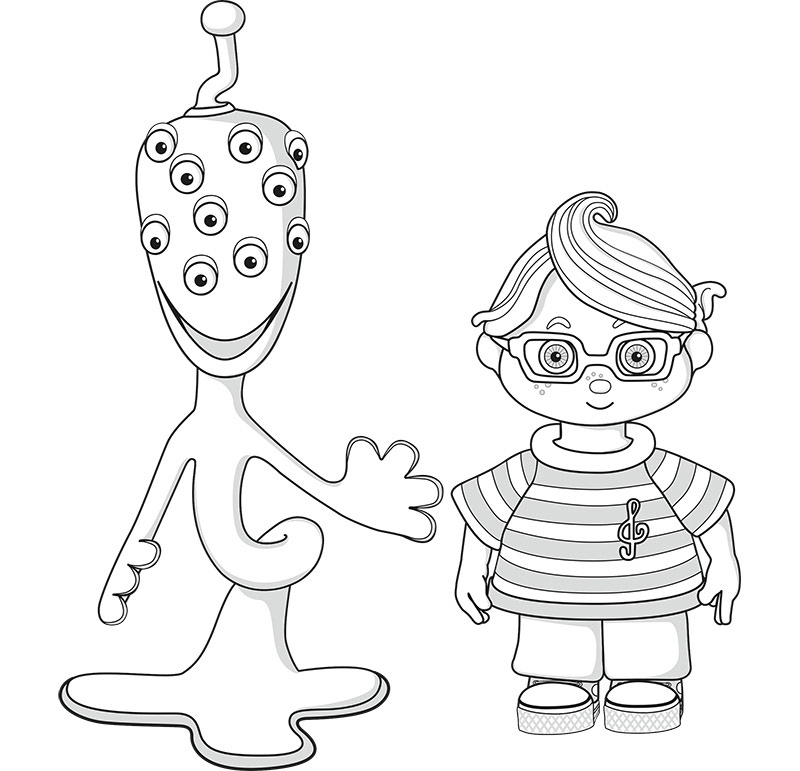
The alien, Pogo, is so-called as his body moves like a pogo stick (a retro reference for parents). He has a playful, child-like character, is a beginner in stop motion, and is gently guided by his friend, Pip.
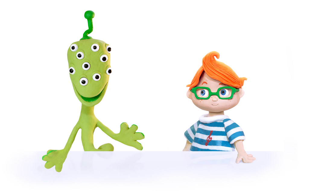
I featured them in various guises in the advertising posters I created (see more here).
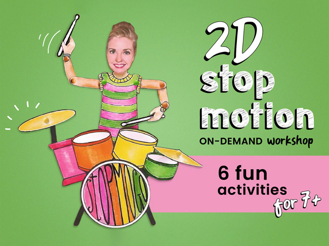
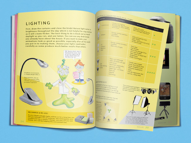
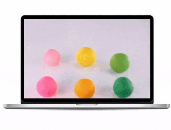
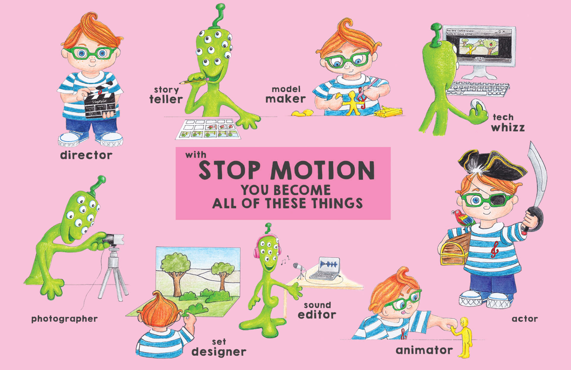
I created hand-drawn illustrations for a book and blog content. Also, vector illustrations that I rigged for animations to demonstrate stop motion activities in my on-demand courses.
ART DIRECTION
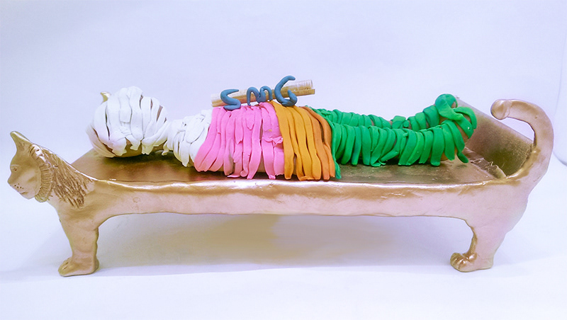
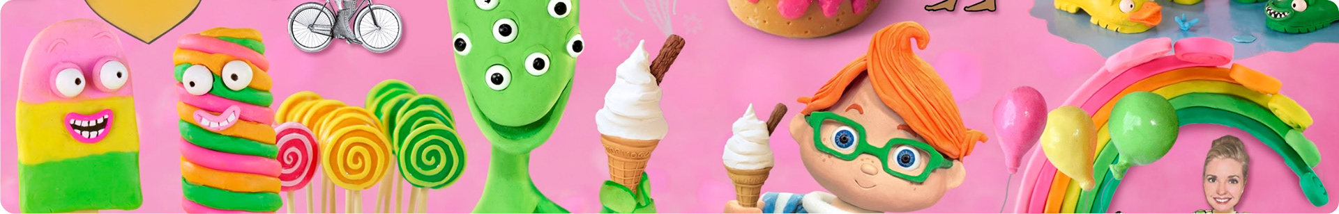
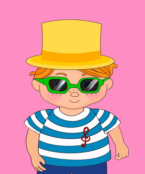
Fun. Playful. Cartoony. Cheeky. Nostalgic. Simple backgrounds - one colour (on brand or white). Two-colour stripes. Signature claymation style.
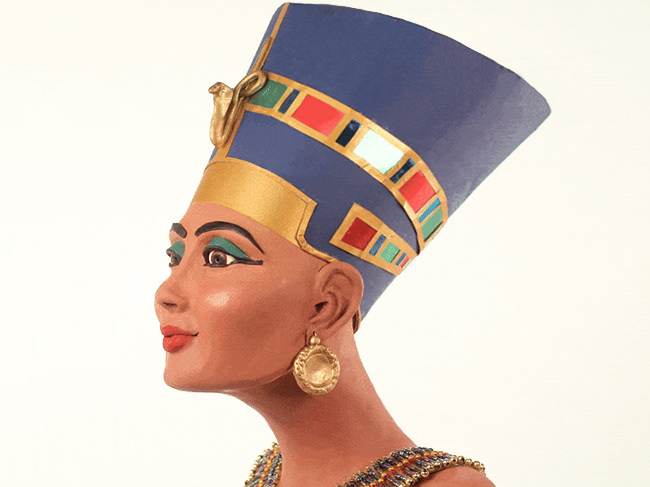
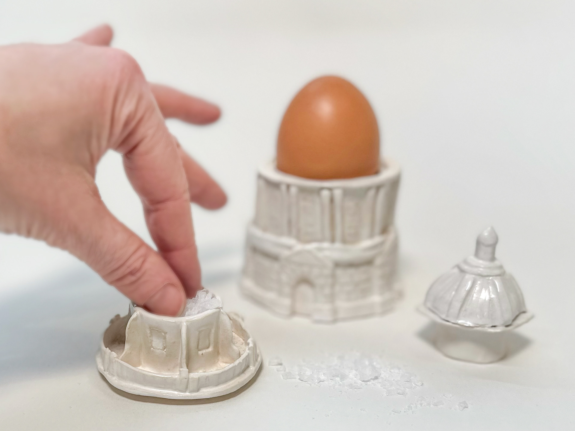
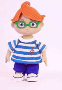
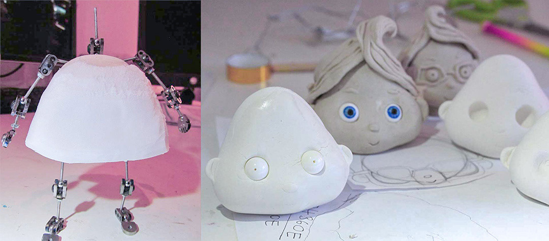
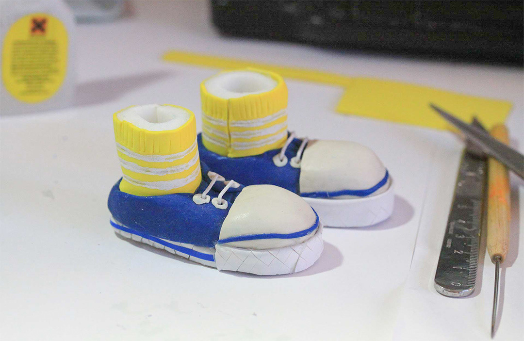
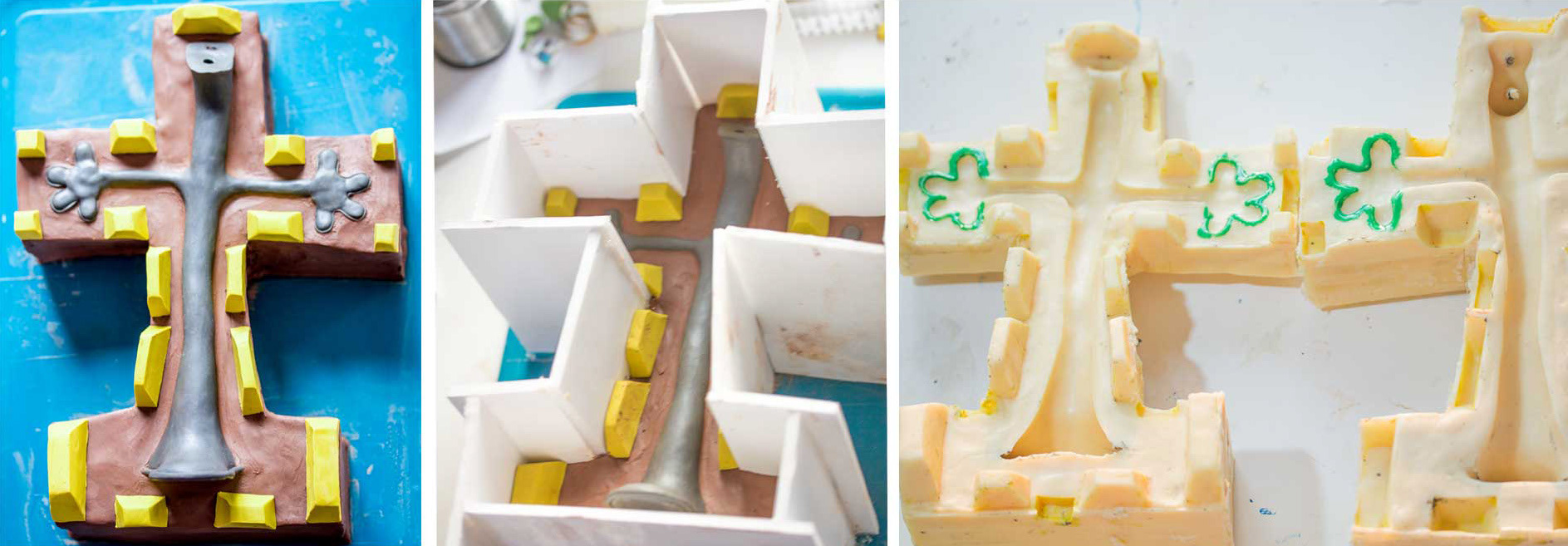
MODEL MAKING

IMPACT
My proudest moments have been when the brand name is used as a verb, by teachers, parents and children. Also, when people incorporate the brand in their own animations.